Painting Articles by Chicagoland Painters
Chicago Painters, Inc. strives to be a resource for the Chicagoland homeowner. Painting a home is one of the biggest steps a person can make, and our company would like to offer valuable tips to those considering such a large undertaking. Please come back on a regular basis, as articles will be added monthly.
Latest Painting Articles

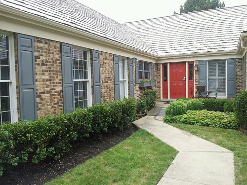
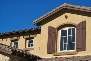
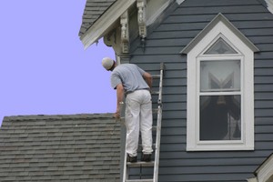
Your home’s exterior is its first line of defense. Quality paint, applied by a pro, helps your siding and trim fight off moisture, UV, and daily wear that Chicago weather throws at it. If you want a deeper dive into service details, explore our professional exterior […]
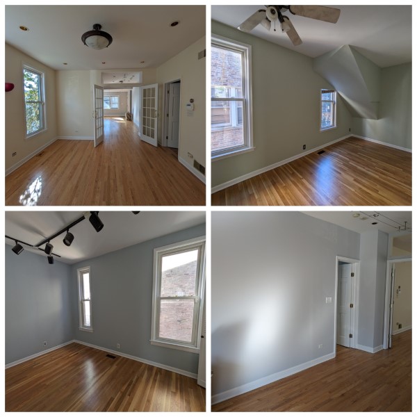
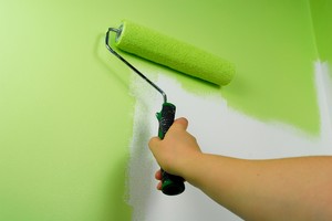
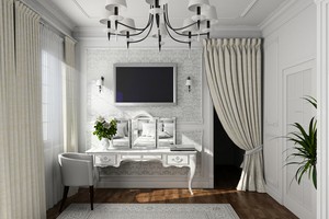
Looking for interior painters Chicago homeowners rely on each spring? A new color is like a fresh breeze for your rooms, lifting light and mood across long-awaited sunny days. If you are ready to update your spaces, explore these high‑impact project ideas and see how they […]

Not sure if your siding can wait another season? Chicago’s freeze–thaw swings, lake winds, and road salt can wear down even quality finishes. Here are the clearest clues your place is ready for a refresh, plus how a pro can map the right plan for your […]

Chicago winters are no joke. Between freeze–thaw cycles, wind off the lake, and road salt mist, your paint film faces months of stress. This guide explains how a professional house painter plans exterior paint protection that holds up in Chicago, IL, and when it makes sense […]

Fall in Chicago brings cool, steady weather and calmer schedules, which is exactly what helps interior paint look its best. If you have been thinking about interior painting, this season gives you comfortable ventilation, reliable dry times, and a smoother path to getting on the calendar […]
Winter is easing, and Chicago homeowners are already eyeing spring projects. If exterior curb appeal is on your list, February is the best moment to lock in your spot for exterior painting in Chicago. The season here is short, crews book up quickly, and the homes […]
Painting is one of the most common ways homeowners refresh their spaces. A fresh coat of paint can make a room feel brighter, more modern, and more personalized. But when it comes time to tackle a painting project, many homeowners wrestle with the same question: Should […]
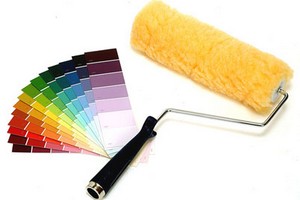
Choosing colors for interior painting can be an exciting yet overwhelming task. The colors you select can have a significant impact on the overall ambiance and aesthetics of your living spaces. Whether you're looking to create a soothing retreat, a vibrant gathering area, or a cozy […]
A deck can be a wonderful investment for your home, providing you and your family with a great space for entertaining, relaxing at the end of a long day, or just accenting your home's already beautiful landscape. Whatever the case may be, wooden decks require regular upkeep to […]
A deck can prove to be one of the best things you could get for your Chicago area home. In addition to providing a great place for you to relax alone or with loved ones, a deck can increase your home’s resale value. Because a deck […]
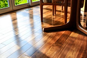
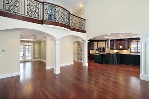
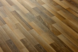
Hardwood flooring is a stunning installation that will add tons of resale value to your Chicago area home. It will also prove to be one of your longest-lasting flooring options, as it can last upward of a century or more -- that is if you take […]

Drywall damage is nothing to take lightly, especially not water-damaged drywall, as that problem can lead to a host of health problems for you. After all, exposure to water-damaged drywall can bring a host of dangers into your Chicago area home or apartment. Mold Mildew Structural weakening To keep your […]
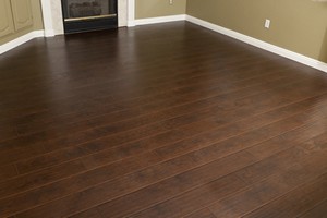
If the flooring in your Norridge home is worn out or damaged beyond repair, you should consider a hardwood floor installation from a skilled house painter. Before you install wood flooring, you must select a type of wood, which may include pine, walnut, or mahogany. Pine […]
If you have hardwood floors in your Wilmette home, you know how diligent homeowners have to be to ensure that their hardwood flooring remains in good condition as it ages. You can repair some scratches, dents, and stains yourself, but extensive damage requires the attention of […]

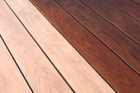
One of the best parts of owning a deck in Elmhurst is choosing the perfect stain color. Although you're free to choose whatever stain color you prefer, your house painter will probably recommend selecting a color that enhances your home's exterior and landscaping. Deck staining is […]

We may be halfway through 2018, but interior painting is a good idea no matter what time of year it is. Before you reach out to a Mount Prospect house painter, take a look at some of the most popular colors of the year. Although you […]
Drywall is a common building material used to form walls, ceilings, eaves, and arches. It is also a fire retardant, protecting buildings so that complete evacuation is possible. However, drywall does not come without its problems, and if you spot a complication with the drywall in […]

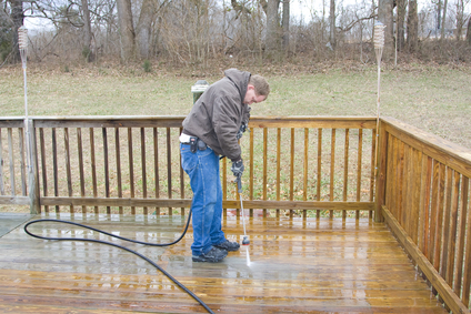
If you are like most homeowners, you understand just how important it is to prepare your home for the coming winter, but what you might not be aware of is how much a professional pressure washing can help you do so. Despite what you might think, […]
Being a Chicago homeowner means being faced with a number of important decisions, including what to do with the flooring. For some people, hardwood is not a viable option, it is the only option. For others, they seem to think the work is more demanding and, […]
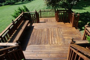
Because of varying weather conditions the exterior of any house deteriorates faster than the interior and one way to improve the outside is with Highland Park deck staining. The insides of any home are always subject to cleaning hence the longer life span. But the exterior […]

If you have an older Northbrook home and want to choose colors other than green and white, here are some guidelines: Light colors "advance" a Northbrook home while dark colors cause it to "recede". This means that lighter shades will make your home appear larger and closer […]

As you inch your way closer and closer to deciding to paint your home, choosing a Chicago painting company is an important part of completing a successful painting project. As you listen to the experiences of family and friends, or sift through the Yellow Pages, you […]
Take a look around at some of the products being sold by your favorite retailers today and you’ll see that “going green” isn’t just a catch phrase anymore; it’s a way of living. But living green isn’t just about driving a hybrid car or eating organic […]

There are various things that you should consider before hiring a Northbrook painting contractor to perform interior painting for different rooms of our house. One of these is choosing the interior paint finishes that have good durability and are easy to maintain. This will aid you […]

Choosing various colors for your Chicago house painting is more difficult than what you think. This is because a wrong choice of shade can either make your house appear too subtle or too vivid. Aside from that, a wrong choice of color can lead your house […]

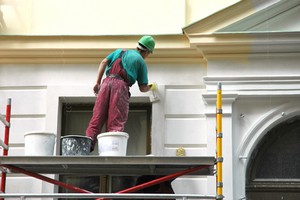
Is the exterior of your Kenilworth house starting to look old and worn down? It may be time to paint the exterior of your house. Unfortunately Kenilworth exterior painting happens to be one of the more expensive and time consuming home improvement projects. And generally homeowners […]

Changing the interior design of a house will be too expensive if furniture will have to be replaced. What could be the simplest solution? Change the interior painting of your River Forest house! Not only that it is the cheapest way, but it will also change […]

The outside paint of a house can reflect the personality of the people living in it and nowadays, Rosemont house painting is one of the most affordable ways to improve the impression of one's home. However, it takes a lot of effort to do this job. […]

Expensive is a relative term of course. A good example is found when buying a car. Some people may consider a European luxury vehicle to be of great value. On the other hand, some may think a domestic mid-prized car is very expensive. What is really included […]

Residence may be the spot which gives you feeling of warmth and comfort after an extended tiring day. The wall paint shades can make your residence glance elegant or funky as per your wish. It has been proved that shades from the walls have an effect […]

The earliest appearance of paint was approximately thirty thousand years ago. There are still some caves today where graphics and pictures can be found that were drawn using paint. Color has fascinated cultures throughout history. Some cultures used colors for healing purposes. Paint is made up of […]

Wall painting is one of the tasks that you can do when you want to upgrade the interior look of your room. Painting your walls can bring new changes and look into the room, giving a fresh and new ambience. You can enjoy experimenting as you […]
Stucco is a hard surface building material similar to concrete; like concrete, it is made of cement, but has lime and sand mixed in as well. It is a breathable material full of voids that permit air and water vapors to permeate. When stucco is left […]

Take extra measures to ensure your painting project is an environmentally safe experience. The best quality acrylic paints are products that contain low or no volatile organic compounds (otherwise known as VOCs). These products reduce the emissions of VOCs into the home which improves indoor air […]

Find a place in your home that rarely gets noticed and have some fun thinking outside the box. When you look up at your ceilings what do you see? Do you see a fun color or a decal or even faux painting, or do you simply […]
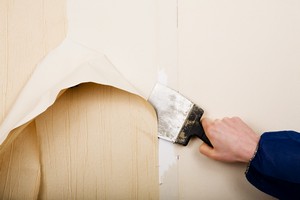
Removing Wallpaper TIPS: Wear rubber gloves when mixing and using this solution. The vinegar will dry out your hands. Mix together 1/3 cup fabric softener with 2/3 cup hot water, or add cup white vinegar to a gallon hot water. Pour either solution into a garden spray and moisten […]
There are many ways to freshen up the look of your Chicago home. Redecorating is an option that many people choose in order to give their house a new appearance. While this is certainly a wonderful way to change things up, it can lead to huge […]

Do you have an idea of doing some Chicago interior house painting it is always a good thing but you have needed some guidelines for it. Most of them exactly not known, how realistically painting is done even most of the people have probably painted a […]

Painting exterior trim on your Chicago home can be thought of costing less than completely painting all exterior surfaces, but a few things to consider from a painting contractor points of view. Most of us look to save where we can, especially in this day and economic […]

Chicago house painting projects can be extremely hectic because of the details and effort involved. It is best to hire a professional painting contractor to handle the job. You can spend a lot of your time looking at different contractors and it may seem that all […]

More and more people are going the home improvement route in order to save money and gain a sense of satisfaction at having done the job themselves. There are a range of levels of difficulty for the practically infinite number of DIY jobs, but many of […]

The most important house project that can be done is Chicago exterior house painting, and with some exterior house painting ideas you can save a lot of time and effort. The effects of the weather can have devastating consequences on your home, so it is important […]

Moving into a new house can be quite an experience. You are totally in a new zone, surrounded by new ceilings and floors near stairs in an entire new layout. You want your home to look the best, so it’s important to pick out the right […]

Chicago house painting and wallpaper are huge items for Chicago home owners. The best way to remove wallpaper is through the following 2 step method. There are plenty of suggested methods, including scoring the wall with a tool, and using a gel type solution to remove the […]

You’re not alone – many Chicago homeowners faced with redecorating their bedroom are afraid to get rid of that bland color that came with the house and go with something more colorful. What holds you back? Are you afraid the color will be too strong? Not […]
Where to Get the Best Painting Contractor For Your Chicago Painting Job If you are going to paint your residential or commercial property in Chicago, it is essential for you to get the best contractor so your property will be painted with the best possible quality. Once […]
Color is a fundamental factor of style and design. It is evident to homeowners that are becoming more experimental with interior and exterior house painting, or interior decorating. This new sensibility to bring colors in every area means that painting companies need to work on product […]

Article By: Paul Bianchina So the time has come to repaint the outside of your house, but you're tired of the old color scheme. If you'd like to try something fresh and new that suits your style, some simple homework will help you get off on the […]

Bob Vila of This Old House fame tells people to "be kind to their neighbors when picking a color scheme". His house painting advice is echoed by realtors and builders across the country. The color that you paint your house, they say, can affect the value […]

Licensed interior designers and color consultants consider the direction a room faces. Whether it is north, south, east, or west, makes a great deal of difference to the choice of color scheme. For instance, a bedroom that faces east and receives strong sunlight in the early […]
The following information will give you some basic knowledge about painting and especially having a Chicago painting company. Once you've decided what color and type of paint you would like, you'll need to get ready for the painter, too! Interior Paints: Latex-based paints are used for most interior […]

Whether you need to paint the interior or exterior of your home, it is imperative to find the right Chicago painter for the project. Having a good home painter will ensure you have a quality job that is affordable and completed in a timely manner. Make […]
So, you've just bought the house and wish to repaint all the walls in each of its rooms. That would be fantastic. Just make sure you don't choose the wrong color. So, let's get it started: * Your Bedroom. It's bedtime. You need a room that can make you […]

The hot color of bedroom produces an aura of confidence and vitality. Hot color makes a creative environment for someone who was their best ideas when comfortably propped un in bed, undisturbed and cocooned in their personal sanctuary. Hot color in the bedroom can either be used […]

There are two kinds of paint to use for your interior and exterior painting jobs, and both have their advantages. Oil based paints are thick paints mixed from resins and oils. Latex or acrylic paints are thinner, water-based paints. How do you know which kind of […]

Now that you have taken into account the fixed features of your home, as well as the context of your neighborhood, you are ready to begin considering your available color options for the exterior of your home. Poor color choice can make your house seem flat, dull, […]

So you want to have your home painted right? But you're not sure who to contact and how much you should pay, as well as what services to expect from the painting contractor you hired? In that case, you should do your homework first about what […]

Paint colors can really do wonders to one's house. The truth is, it can revitalize a home's surface, from the ceilings to the walls and the exterior. However, it is also a fact that choosing among the thousands of available colors for house painting can make […]

Painting is one of the most commonly done home renovation or repair. It gives a new look to the house without making any changes to its structure. It is the easiest way to add new appeal to home aesthetics. Though many people like to paint their […]

Our lives are getting very busy, and with that comes very little time to maintain housing projects such as painting. It is much more convenient to hire a painting contractor. By hiring a professional, you will get a higher quality paint job, as opposed to a […]

(ARA) Despite a slumping economy, home improvements remain a popular investment for homeowners. With paint rollers and hammers in hand, they're getting the most out of their home-improvement dollar with do-it-yourself projects that make a dramatic difference. Three-quarters of Americans and Canadians plan to renovate this year, […]

Hiring the right painting contractor can be a difficult task. Take a lesson from business and follow these steps to finding the right painter. Imagine you are a company, you are hiring an employee, the painter. That employee works for you and you are the boss. […]

Your house is your lifetime asset. And it's a matter of time when you take a notice that your house needs renovation - not because it's getting old, but because you feel the need of vibrant colors in your house. Repainting your house is a tricky business. […]

Changing the color of your interior walls is an excellent way to increase the resale value and appeal of your home. It is a cost-effective way to add style, personality, and warmth to any room. In fact, it is so cost-effective, that some choose to paint […]

Many home owners report that their concrete does not look as good as it first did, and indeed some concrete looses its looks and become cracked and dimples and rust stains. This look damages the house look and many find it to be plain ugly, the […]
The first and most obvious benefit of hiring a professional painter and decorator is ease of use. Whilst it's true that most people can decorate to an okay standard, a lot of the time people do not take into account just how time-consuming the whole process […]

Four to five year into your new house, you feel that the walls have lost its sheen, facing the wrath of the Sun, Wind and the Rains. However thoughtful you may be, two sides of the house may face the rays of the Morning and the […]

Simple answer - because you cannot compromise the value of your home. A shoddy painting job can turn off even the most interested buyer and make your home's value plummet significantly. Yes, it is admirable to want to do the whole thing yourself and not have […]